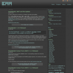
After months of design changes and WordPress theme customizations, I’m happy to introduce the latest version of EricMMartin.com!
I’ve actually been working on this redesign, on again, off again, for the last year or so. Although the design has been through a number of changes, the technologies I wanted to build the site with have remained the same: WordPress and jQuery.
So, I’d love to hear your thoughts on the new design – please leave a comment. If you didn’t see the previous version, here’s a screenshot of what it looked like:
Go ahead and say it, it’s OK, the previous version was ugly. Hopefully the new design is easier on the eyes.
As a side note, I’ll be starting a series or articles that will cover the redesign and development process in more detail. The articles will focus on topics such as creating a custom WordPress theme, client-side development using jQuery, and website performance. If you are interested in any of those topics, be sure to subscribe or bookmark this site.

I love that you’re using the flickr api to show the comment count on the front page. And you’ve heard the rest of my praise for the new design already. I still love it.
@Joel Goodman – Thanks! I plan to expand with the Flickr API and use it to create a full-fledged gallery…as time allows 😉
It is a great job! Very simple and clear and perfectly designed! I added you in my blogroll because I’ve seen we have a lot of subjects in common
cheers!!
Well, I liked the look of the new layout. Although, this darker style color turns reading more difficult, mainly because it forces our eyes. I noticed that trying to read the new 1.3 Simplemodal description, which I gave up before finishing it.